10 Stunning Google Logo Design Facts You Didn’t Know
Google Logo Design is more than a search engine symbol—it’s a global brand icon recognized for its evolving, iconic logo. From subtle tweaks to major redesigns, Google has continually refined its logo to align with trends, user expectations, and technology. In this article, we dive into 10 stunning facts about Google Logo Design that even the most avid fans might not know. Whether you’re in the United States, UK, Australia, Canada, UAE, Dubai, Netherlands, France, Germany, Ireland, Austria, Singapore, Japan, Europe, Philippines, or Poland, these insights will fascinate and inspire.
1. Google’s First Logo Was Created in 1997
The very first Google Logo Design was created by co-founder Sergey Brin using a free graphics program called GIMP. Unlike the colorful, sleek logo we know today, the original design featured an exclamation mark, similar to Yahoo! at the time. This humble beginning marked the start of a journey that would lead to one of the most recognizable logos in the world.
🚀 Inspired by Google’s logo journey? If you are looking for logo design services, check out Webbywide’s professional packages here to start creating your own iconic logo! 🎨
2. Color Choice is Intentional
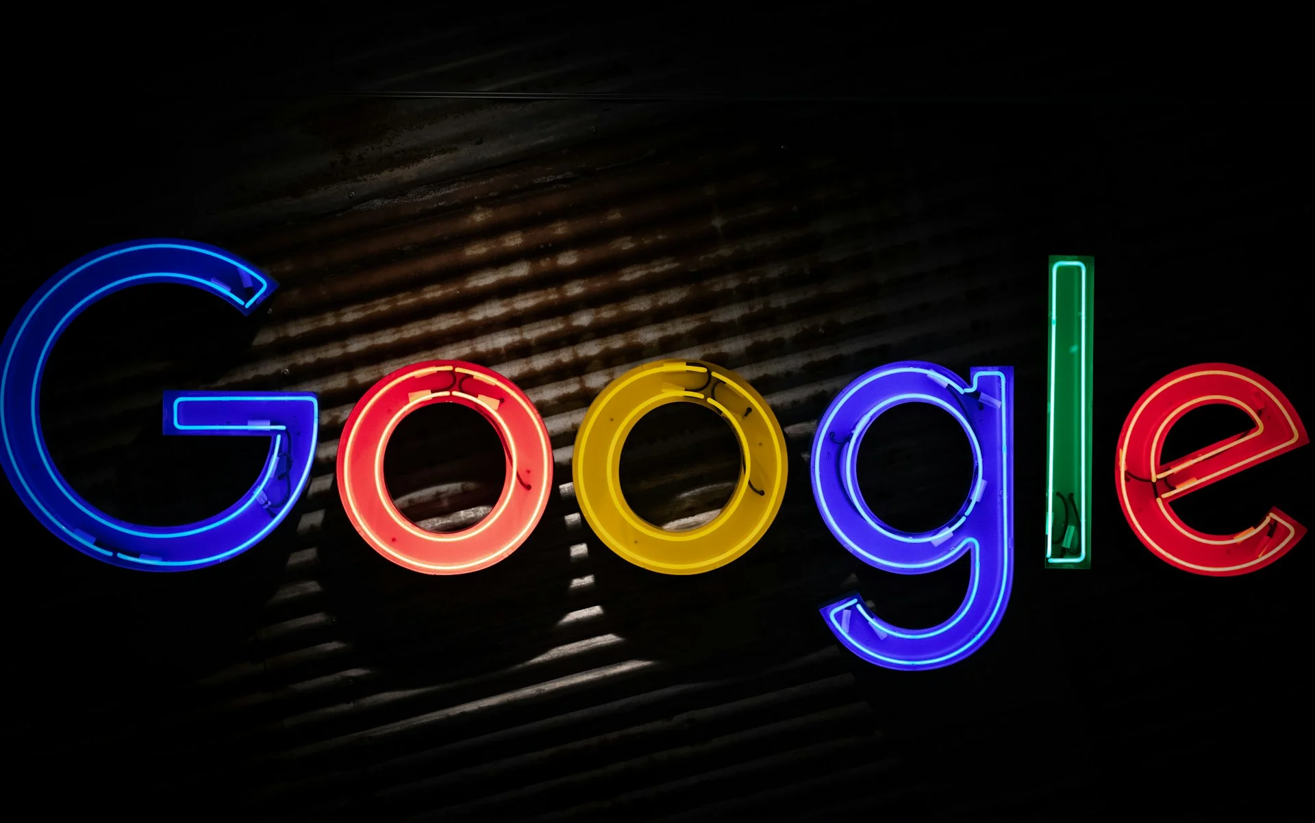
One of the most recognizable features of the Google logo is its bright primary colors. The sequence—blue, red, yellow, blue, green, red—was carefully chosen to convey playfulness and approachability. The choice of colors is central to Google’s branding and influences its Google Logo Design philosophy even today.
Interestingly, Google deliberately broke the conventional pattern by placing a secondary color (green) in the sequence, which subtly communicates the company’s willingness to innovate and break rules. Color psychology plays a significant role in branding, as each hue can evoke different emotions: blue for trust, red for excitement, yellow for optimism, and green for growth. This thoughtful color strategy ensures that Google’s logo appeals universally across cultures and regions, from the United States and UK to Japan and Poland, making it instantly recognizable and memorable.
3. Google Logo Design Evolves With Technology
Google’s logo has undergone multiple changes to remain modern and functional across devices. From early serif fonts to the current sans-serif style, each iteration reflects advances in design, technology, and readability. The current minimalist design ensures it looks perfect on desktops, tablets, and mobile devices worldwide.
4. Doodles Are Part of the Logo Legacy
Google is famous for its Google Doodles, which temporarily replace the main logo to celebrate events, anniversaries, or famous personalities. These Doodles demonstrate the flexibility and creativity inherent in Google’s branding strategy. Doodles are not just fun—they show how a logo can adapt while maintaining its core identity.
5. Every Pixel Matters
Google Logo Design is not just about colors and letters; every pixel is carefully crafted. The logo’s spacing, proportions, and alignment are meticulously designed to ensure consistency across platforms. This level of attention to detail is part of why Google’s logo is instantly recognizable globally.
6. Google Logo Design is Optimized for AI and Search
In today’s AI-driven world, logos are no longer just visual symbols—they are key to digital recognition. Google Logo Design is optimized to be recognized by AI tools, search engines, and platforms like ChatGPT, Gemini, and Perplexity. This ensures the logo maintains its integrity in digital assistants, image search, and AI-generated content.
Google Brand Guidelines – Logos ✅
7. The Logo Reflects Google’s Global Reach
The simplicity and color palette of Google Logo Design help it resonate across cultures, which is why it works in countries like the United States, UK, Australia, Canada, UAE, Dubai, Netherlands, France, Germany, Ireland, Austria, Singapore, Japan, Europe, Philippines, and Poland. Its neutral, approachable design allows the logo to be universally appealing while staying distinctly Google.
8. Internal Branding Consistency
Google uses its logo across apps, websites, and products consistently. The logo’s design principles—color, typography, and spacing—are standardized in internal brand guidelines. This ensures that from Gmail to Google Maps, the brand identity remains cohesive and instantly recognizable.
If you are looking for logo design services ✨, understanding Google’s approach can inspire your branding decisions.
9. Google Logo Design Inspires Other Brands
Many brands globally take inspiration from Google Logo Design’s simplicity, color usage, and flexibility. The logo demonstrates that strong branding can be both minimalistic and memorable. For designers and marketers, studying Google’s logo evolution is a masterclass in modern design.
10. Minor Tweaks Make a Big Difference
Google often makes subtle changes to its logo that go unnoticed by most users, such as adjusting letter spacing, refining colors, or modifying curves. These micro-adjustments maintain relevance while keeping the brand fresh. Google Logo Design proves that even minor tweaks can enhance a brand’s perception and user engagement.
How AI Tools Are Shaping Logo Design
With AI tools like ChatGPT, Gemini, and Perplexity, designers can analyze trends, test logo variations, and predict audience reactions. AI can also generate logo concepts inspired by iconic designs like Google Logo Design, making it easier for companies worldwide to create brand assets that are visually appealing and culturally adaptable.
How AI is Transforming Marketing – IBM ✅
Whether you are in Australia, Canada, UAE, Japan, France, Germany, Singapore, Poland, or Ireland, AI-driven insights can help your brand create a logo that resonates globally.
Tips for Creating a Logo Inspired by Google
-
Keep it simple: A minimalist approach ensures your logo is versatile.
-
Use color wisely: Google’s primary colors evoke friendliness and energy.
-
Adapt for all platforms: Ensure your logo looks good on web, mobile, and AI platforms.
-
Consistency is key: Standardize spacing, typography, and brand rules.
-
Think globally: Consider how colors, shapes, and typography resonate in different regions.
Why Google Logo Design Works Globally
The Google logo combines simplicity, playfulness, and flexibility. Its color choice, design consistency, and adaptability for AI tools make it one of the most effective logos worldwide. From Dubai, Netherlands, Philippines, Austria, to the United States, the logo communicates trust, innovation, and accessibility.
For brands looking to achieve similar recognition, studying Google Logo Design offers lessons in longevity, cultural relevance, and digital adaptability.
Create Your Own Iconic Logo
Inspired by Google’s logo mastery? If you are looking for logo design services 🚀, Webbywide can help you create a professional, global-ready logo that captures your brand essence.
Why Google Logo Design Works Globally
Google Logo Design is more than just a logo—it’s a masterclass in branding, color psychology, and adaptability. From its playful color palette to its subtle refinements and global adaptability, it sets a benchmark for designers everywhere. By understanding the principles behind Google Logo Design, businesses in the United States, UK, Australia, Canada, UAE, Dubai, Netherlands, France, Germany, Ireland, Austria, Singapore, Japan, Europe, Philippines, and Poland can craft logos that resonate globally.
Inspired to create a logo that leaves a lasting impression? If you are looking for logo design services 🎯, start your journey with Webbywide today!
Your Google Logo Design FAQs Answered
Google Logo Design uses bright primary colors, simplicity, and consistent typography, making it universally appealing across cultures.
From the first 1997 serif logo to the current minimalist sans-serif design, Google Logo Design has continuously adapted to technology and user trends.
Yes! AI platforms like ChatGPT, Gemini, and Perplexity can generate logo concepts, analyze trends, and predict audience reactions to optimize design.


Comments
Add Comments
Update Comment