Effective Logo Design Tips for Instagram and YouTube
In today’s fast-paced digital environment across the United States, logo design plays a vital role in establishing brand identity on visual-heavy platforms like Instagram and YouTube. For creators and businesses in the US market, the right logo can quickly communicate your voice, values, and vibe in just a glance. But what exactly makes a logo perform well on these platforms—and how can you create one that engages viewers, drives recognition, and stands out in crowded feeds?
This guide covers everything you need to succeed in the USA digital space:
-
Why logo design matters on Instagram & YouTube in the US
-
Top trends shaping social platform-friendly logos in the United States
-
Key principles every logo design must follow
-
Step-by-step process for creating yours in the US market
-
How to build a logo that works everywhere, from New York to California
-
Optimization tweaks for profile icons, banners, and more
-
Common pitfalls—and how to avoid them
-
Real-world examples of high-performing logo design in the United States
-
How to test, evolve, and refresh your logo as your US brand grows
1. Why Logo Design Matters on Instagram & YouTube
-
First impressions are super fast in the US digital landscape: Users in the United States scroll quickly—your logo design has mere seconds to register and hook them.
-
Consistency builds recognition for American audiences: A consistent logo used across profiles, thumbnails, and banners helps US-based brands build trust.
-
Mobile-first platforms need clarity for US users: Most Instagram and YouTube interactions happen on mobile—simplicity is key for engaging US followers.
-
Brand trust fuels engagement across the US: A polished, thoughtful logo design conveys reliability and professionalism to your US audience.
When executed well, your logo design becomes a trust anchor—driving more follows, subscriptions, and shares from viewers across the United States.
2. Trends Shaping Logo Design for Social Platforms
Staying current with what resonates visually in 2025 across the US is essential:
-
Minimalist style: Bold shapes, pared-down fonts, limited color palettes help your logo pop in small sizes, whether you’re in Chicago or Los Angeles.
-
Responsive variations: Adaptable logo designs (icon-only, full lockups, or text-only) offer flexibility across profile icons, overlays, or banners popular with US audiences.
-
Animated logos: Short .gif or .mp4 versions of your logo can enrich intros/outros and boost engagement for US creators.
-
Handwritten fonts & organic shapes: These inject personality and authenticity, especially on Instagram feeds across the US.
-
Gradient overlays: Subtle gradient textures add modern depth without cluttering small-scaled logos popular among US brands.
-
Negative space techniques: Clever use of negative space can make your logo more memorable to US users—even in tight dimensions.
3. Essential Principles for Effective Logo Design in the US Market
Regardless of trend, every social platform logo design aimed at the United States audience needs to hit three pillars:
-
SimplicityAvoid clutter. Stick to one icon and one font, max 2–3 colors. According to design standards promoted by the American Institute of Graphic Arts (AIGA), simple logos are easier to remember and recognize across the US.
-
Scalability
Your logo must look sharp from a 40 px Instagram icon to a full-screen YouTube banner viewed by US users. Wix recommends ensuring your design is "scalable… sharp and recognizable" at all sizes. -
Versatility
Design flexible variations—icon-only for profile pics, horizontal lockups for cover art, solid backgrounds for thumbnails used by US creators.
Extra tips from Wix include avoiding too many fonts or colors, ensuring proper spacing, and favoring more timeless design over overly trendy one-offs common in the US market.
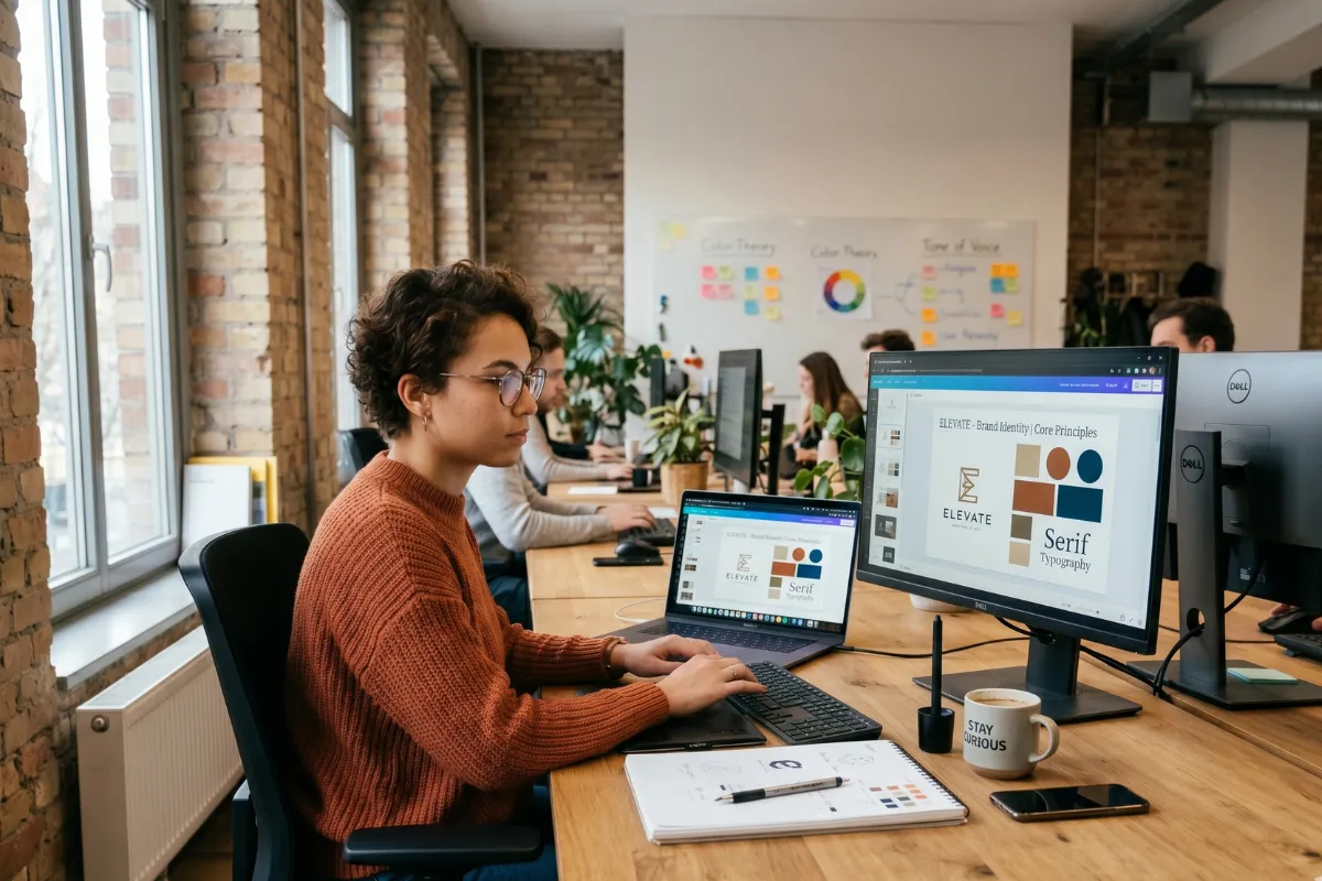
4. Step-by-Step: Your Ideal Logo Design Process
Here’s a clear, stepwise path to crafting a social-ready logo design for Instagram and YouTube users across the United States:
Step 1: Research & Moodboarding
-
Analyze top US-based accounts in your niche—note icons, color schemes, typography.
-
Gather inspirational designs from Behance, Instagram, Logo Lounge, etc., focusing on the US market.
-
Create a mood board in Figma or Milanote with 20–30 examples to uncover patterns popular in the USA.
Step 2: Define Core Elements
-
Choose a simple shape or icon representing your brand’s vibe (a play button, camera, brush, etc.) that resonates with your US audience.
-
Select 1–2 fonts: a strong display font (for visibility) and a secondary if needed, preferably popular with US users.
-
Pick a primary color + 1 complementary shade—bold but clean, considering color trends in the United States.
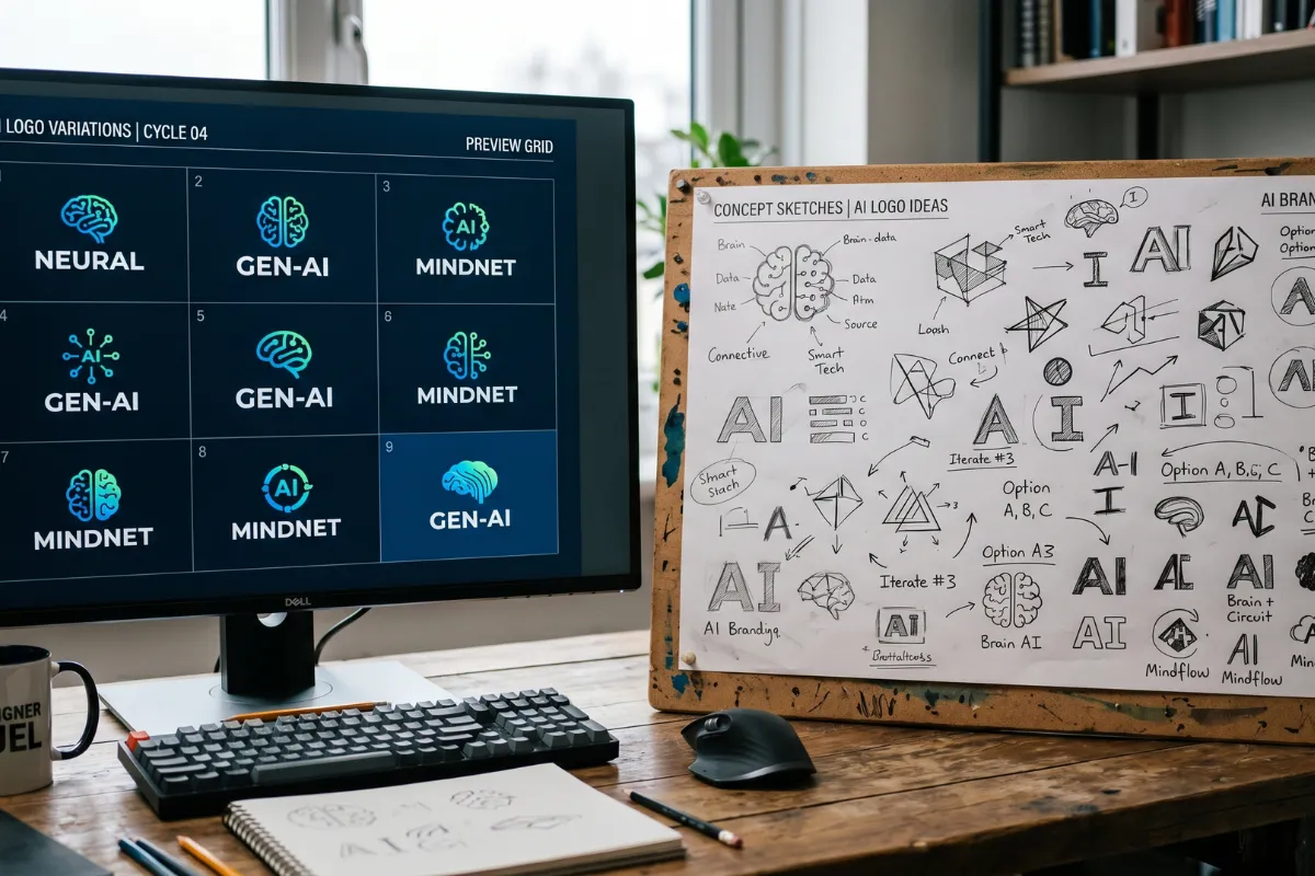
Step 3: Sketch & Concept
-
Rapid sketch 20–30 variations on paper or digitally, focusing on icon+text arrangement, spacing, and composition for US viewers.
Step 4: Digitalize in Vector
-
Import your best sketches into Adobe Illustrator, Affinity Designer, or Figma.
-
Create a version with icon above text and one with icon beside text.
-
Duplicate and remove the text to test as an icon-only variant used in US social profiles.
Step 5: Test Scalability
-
Export at 40px, 80px, 512px sizes. If it loses clarity or legibility for the US mobile audience, simplify.
-
Confirm elements are clear and distinct at tiny sizes.
Step 6: Add Optional Animation
-
Use After Effects or Canva to create a subtle motion intro popular among US content creators—like a drawing animation or simple morph.
-
Keep it short (1–3 seconds) for use in Instagram stories, TikTok reels, or YouTube intros.
Step 7: Final Review
-
Compare against your mood board and trends to ensure modern appeal in the United States.
-
Make sure it aligns with your brand tone (fun, professional, edgy).
-
Ask peers or potential followers in the US for candid feedback.
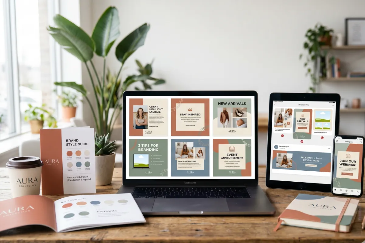
5. How to Build a Logo That Works Everywhere in USA
Creating a logo for Instagram and YouTube in the USA requires more than just visual appeal—it must be adaptable, consistent, and functional across a wide range of digital contexts common in the US market. A well-crafted logo should retain its identity no matter where it's placed or what size it's displayed in. Here’s how to build one that performs across every platform:
Focus on Versatility from the Start
A strong logo should work across formats: square, circular, rectangular, full-screen, and thumbnail. Plan for responsive versions such as:
-
Primary logo: Full icon + wordmark used for your website, long-form video intros, or media kits aimed at the US audience.
-
Secondary version: Icon-only for social avatars, reels, and watermark usage typical on Instagram and YouTube in the US.
-
Single-color variation: Use this for overlays, stamps, or simplified branding in the United States market.
-
Inverted logo: For dark or light backgrounds, make sure it always stays visible and sharp for US viewers.
Design these variants early on—rather than trying to crop or force-fit your original design later.
Test in Real-World Sizes
Before finalizing your design:
-
Export versions at 40px, 80px, and 512px.
-
Simulate Instagram and YouTube placements by uploading mock logos to test accounts or preview templates often used by US content creators.
-
Zoom out and check legibility at a glance. If it disappears in a feed, simplify.
Balance Simplicity and Uniqueness
In striving to stand out in the competitive US social media space, some creators go overboard. Avoid intricate details, gradients, or overlapping elements that can blur or distort at small sizes. Focus on one core icon or shape that visually represents your niche and tone—whether that's sleek, playful, bold, or creative.
Contrast, clean lines, and a bold silhouette are key to recognition, especially on mobile in the United States.
Keep Your Branding Consistent
Once your logo design is set:
-
Apply it consistently across all profile pictures, thumbnails, intros/outros, highlight icons, and video end screens targeting US viewers.
-
Use the same color palette and visual tone across platforms popular in the US.
-
Avoid unnecessary tweaks between platforms—consistency improves recall.
6. Optimizing Placement & Sizes for Social Platforms
How you apply your logo design matters especially in the US market:
-
Profile icon must align within a 110×110 px circle—keep essential elements centered for US users.
-
For stories and highlight covers, maintain consistent styling across circles.
YouTube
-
Use square logo for channel icon (98×98 px).
-
Include both horizontal and stacked versions in banners.
-
When adding your logo overlay to videos, use semi-transparent or white versions suitable for US audiences.
Watermarks & Thumbnails
-
Use clean, light or semi-transparent logo overlays on video thumbnails viewed by US users.
-
Avoid blocking faces or key visual content.
7. Frequent Pitfalls and Strategies to Avoid Them
Overly complex icons:
Cut intricate details—simplify shapes for clear visibility at small sizes on US devices.
Illegible fonts:
Test readability at 40px—if characters blur, switch to a bolder typeface popular in the US.
Too many colors:
Stick to 2–3 colors max; too much variety muddies your logo design and can confuse US viewers.
Following trends blindly:
A trendy logo may date quickly. Prioritize timeless readability appreciated in the United States.
Inconsistent use:
Use the same logo across all platforms in the US—uniform color, padding, and style.
8. Proven Logo Designs Driving Success
-
Nike “Swoosh” – iconic, simple, fully recognizable at any size, and a quintessential US brand.
-
Coca‑Cola wordmark – distinct script, timeless and legible across the US.
-
Hillary Clinton campaign logo – widely reused across US profiles and media; great example of adaptable branding.
-
Wix Hand‑drawn approach – manual font gives authenticity and resonates with the creative US market.
9. Testing, Evolving & Refreshing Your Logo in the US
-
A/B test variants through Instagram ads or YouTube channel experiments targeting the US market.
-
Collect feedback via stories polls or surveys from your US followers.
-
Refresh every 2–3 years: refine typography, color, or layout—don’t fully rebrand unless strategy shifts in the US market.
Making Your Logo Shine in the US Market
A powerful logo design does more than look good—it attracts attention, builds brand credibility, and adapts flawlessly across mobile-first platforms like Instagram and YouTube that dominate the United States market. Use this guide to:
-
Keep your logo simple, readable, and scalable for US users
-
Embrace modern trends without sacrificing clarity
-
Iterate regularly based on data and feedback from your US audience
Take your time during conception—your logo will become the face of your online presence and the foundation for your entire visual identity in the US digital space.
Ready to elevate your logo for the US market?
Drive maximum engagement with a pro-level logo design that reflects what your brand stands for across the USA. Explore premium logo design packages and expert services here

Comments
Add Comments
Update Comment