From Sketch to Screen: The Complete Logo Design Process
Every memorable brand starts with a powerful visual identity — and at the heart of that identity lies its logo design. From a rough pencil sketch to a polished digital masterpiece, creating a logo is both an art and a science.
In the United States, where brand competition is fierce and digital presence defines credibility, a strong logo isn’t optional — it’s essential. Understanding the logo design process not only helps businesses make better creative decisions but also ensures the final outcome aligns with their values and goals.
This detailed guide walks you through the complete logo design journey, from brainstorming concepts on paper to final digital rendering — giving you a deeper appreciation of how great logos come to life.
1. Understanding the Purpose of a Logo
Before the first sketch is even drawn, it’s crucial to define why the logo exists. A logo is more than a decorative symbol — it’s the visual voice of a brand.
A good logo design:
-
Captures the company’s values and mission.
-
Builds instant recognition among audiences.
-
Differentiates the brand from competitors.
-
Evokes trust and emotional connection.
In the US market, where customers are constantly exposed to visual branding, clarity and simplicity often outperform complexity. A well-thought-out concept lays the foundation for everything that follows.
2. Research and Brand Discovery
Research is the backbone of professional logo design. Designers begin by understanding the client’s business, target audience, and competitors. This phase includes:
-
Brand Personality Mapping – defining whether the brand is playful, professional, luxurious, or minimal.
-
Audience Insights – identifying who the logo must appeal to.
-
Competitive Analysis – studying what works (and what doesn’t) in similar industries.
In the United States, brands that connect emotionally with their audience often lead their sectors — think Nike, Starbucks, and FedEx. Their logos are instantly recognisable because research guided every design decision.
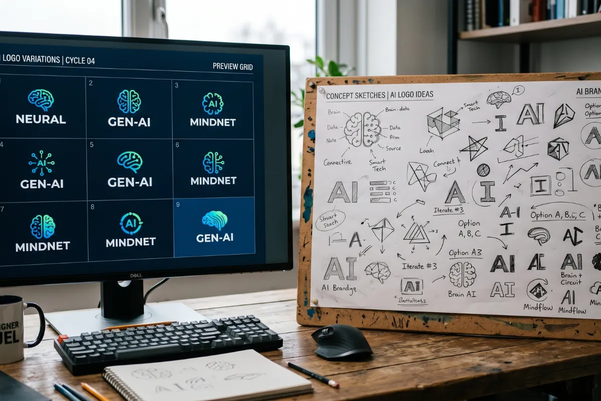
3. Brainstorming and Concept Ideation
Once research is done, designers begin brainstorming visual ideas that represent the brand’s essence.
This involves sketching shapes, symbols, and typography ideas on paper — a crucial step because it frees the mind from digital constraints.
Common brainstorming methods include:
-
Mind Mapping (exploring keywords and visual associations)
-
Symbolic Thinking (turning brand traits into visuals)
-
Thumbnail Sketching (quick rough drafts to test concepts)
At this stage, there are no bad ideas — every sketch helps move closer to the perfect logo design.
4. From Sketches to Digital Drafts
After selecting the most promising sketches, designers bring them into digital software such as Adobe Illustrator, CorelDRAW, or Figma. This is where the magic happens — turning hand-drawn concepts into scalable vector designs.
Here’s what this stage includes:
-
Vector Tracing – redrawing the chosen sketch for clarity.
-
Layout Exploration – experimenting with symmetry, balance, and alignment.
-
Typography Selection – testing different fonts for tone and legibility.
This digital stage ensures the logo design can scale across various media — from business cards to billboards — without losing quality or impact.
5. Colour Psychology and Palette Selection
Colour plays a massive role in how a logo communicates. Different hues evoke different emotions:
-
Blue – Trust, reliability, professionalism.
-
Red – Energy, excitement, urgency.
-
Green – Growth, balance, sustainability.
-
Black and White – Elegance, timelessness, versatility.
For brands in the USA, designers often consider colour accessibility and cultural perception to ensure inclusivity and relevance. A thoughtful palette enhances memorability and brand recall.
6. Typography and Font Selection
Typography adds personality to the logo design. Serif fonts often feel traditional and reliable, while sans-serif fonts appear modern and clean. Script fonts can convey elegance, creativity, or emotion.
Designers test various font pairings to ensure the logo remains legible at every size. Consistent typography also allows the logo to work across print and digital platforms — a key factor for businesses operating in the United States’ digital-first landscape.
7. Refinement and Iteration
No great logo is created in one go. Refinement involves testing, tweaking, and evaluating how each design element works together. Designers seek feedback from peers, clients, and even small test groups to understand perception.
Adjustments often include:
-
Slight tweaks in line weight or spacing.
-
Modifying colour shades for better visibility.
-
Testing different compositions for balance.
This stage ensures that the final logo design not only looks appealing but functions effectively in every context — social media, packaging, signage, and more.
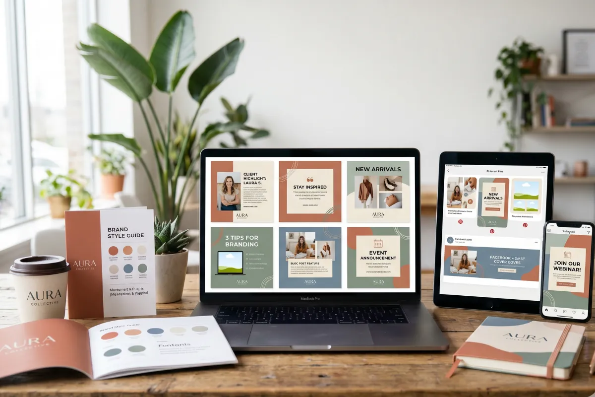
8. Presentation and Feedback
Once refined, designers prepare a professional presentation that demonstrates how the logo works in real-world applications — mockups on websites, apparel, packaging, and stationery.
Clients then review multiple versions, providing feedback on preferences and alignment with brand vision. Constructive collaboration here is key to achieving a logo design that satisfies both creativity and strategy.
9. Finalisation and Delivery
After approval, the final logo design is exported into various file formats — including vector (AI, SVG), raster (PNG, JPG), and monochrome versions for flexible usage.
Designers also prepare a brand style guide, outlining logo spacing, colour codes, and typography rules to maintain consistency across platforms.
Consistency is especially vital for US-based brands that operate across diverse digital environments, ensuring uniformity and professionalism.
10. Long-Term Maintenance and Evolution
A great logo grows with the brand. Over time, trends evolve, and businesses may refresh their logo to reflect new goals or audiences.
Many iconic companies in the United States have subtly evolved their logos — Google, Apple, and Pepsi, for instance — maintaining brand recognition while modernising their look.
Periodic evaluation keeps the logo timeless, ensuring it continues to communicate relevance and trust.
Expert Insight: Professional Standards in Design
According to the American Institute of Graphic Arts (AIGA) — one of the most respected design bodies in the USA — the best logos are those that communicate a clear message, remain versatile, and stand the test of time.
Their principles reinforce that logo design is not just visual creativity but strategic communication.
Keeping Your Logo Vision Alive
The journey from sketch to screen reflects more than design skill — it’s about storytelling, emotion, and precision. In today’s fast-moving US market, a thoughtfully crafted logo design can become the cornerstone of your brand’s legacy.
A great logo doesn’t just represent a business; it defines it.


Comments
Add Comments
Update Comment