Top Cosmetic Companies Logos That Define Premium Branding
In the global beauty market, creating a powerful brand identity is just as important as the product itself. With competition growing across the US, Canada, Australia, the UAE, and Europe, brands must rely on visual storytelling to communicate trust, luxury, and quality. That is where Cosmetic Companies Logos play a defining role. A well-crafted logo doesn’t just represent a brand—it becomes the face of the business and shapes customer perception from the first glance.
In today’s saturated cosmetic industry, premium branding truly begins with a memorable and meaningful logo. Whether it’s a high-end skincare line, a natural beauty brand, or a bold makeup company, the right design helps brands stand out, stay relevant, and create loyalty. This article explores how Cosmetic Companies Logos define premium branding and how companies can use design strategies to build a strong market presence.
Why Cosmetic Companies Logos Matter Today
Premium beauty consumers have become extremely selective. They expect high quality not only from the product but from every point of interaction—including the logo. A powerful logo can instantly communicate:
-
Luxury and exclusivity
-
Clean formulations or natural origins
-
Modernity and elegance
-
Professionalism and trustworthiness
-
Brand personality and story
Because the cosmetic industry is highly visual, Cosmetic Companies Logos must be carefully crafted to match both product identity and emotional appeal. Whether displayed on packaging, websites, product boxes, or social media, the logo acts as a consistent reminder of the brand’s values.
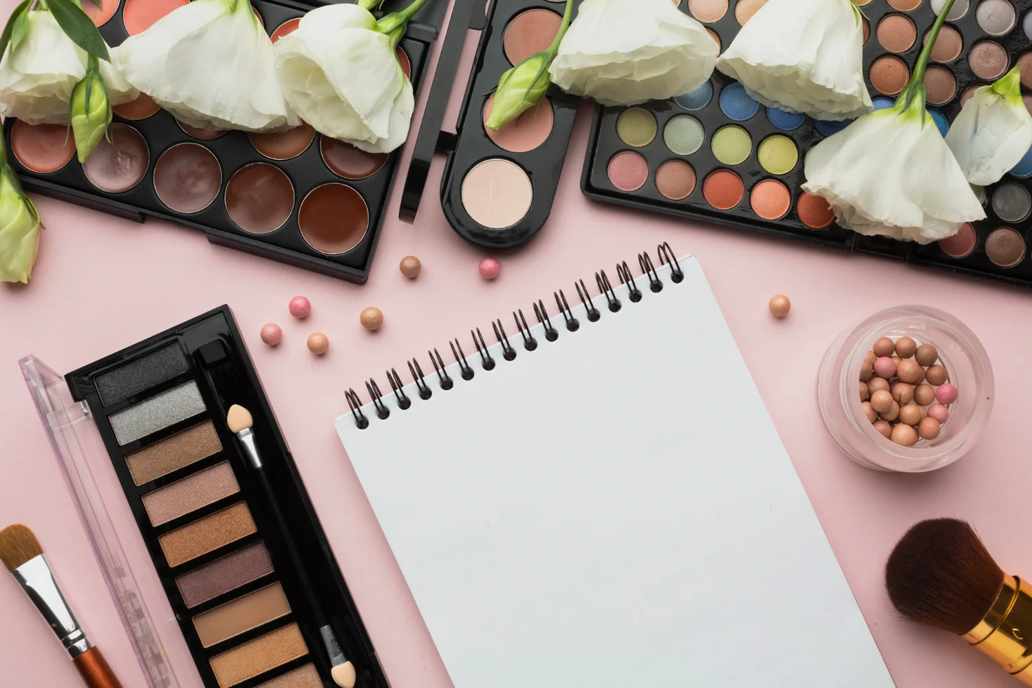
Elements That Make Cosmetic Logos Premium
Luxury cosmetic brands use strategic elements to elevate their visual identity. Understanding these can help businesses refine or redesign their own logos.
1. Minimalism With Meaning
Premium brands often lean toward clean, simple, minimal logos. Minimalism signals luxury, confidence, and sophistication. The less visual noise, the more premium the brand feels.
Many successful Cosmetic Companies Logos rely on simple typography or subtle iconography to create a lasting impression.
2. Elegant Typography
Typography reveals a brand’s personality. Serif fonts suggest elegance and tradition, while sans-serif fonts give off a modern, clean vibe.
A well-chosen font can instantly make Cosmetic Companies Logos look luxurious and trustworthy.
3. Soft and Neutral Color Palettes
High-end cosmetic brands frequently use neutral tones:
-
Beige
-
White
-
Soft pinks
-
Gold
-
Deep blacks
These colors evoke purity, calmness, and quality—qualities essential in premium branding. For brands targeting global markets, these palettes perform exceptionally well.
For further inspiration on color psychology in design, you can explore Adobe Design Inspiration Library.
4. Iconography Inspired by Beauty and Nature
Cosmetic Companies Logos often use symbols such as:
-
Leaves
-
Flowers
-
Droplets
-
Silhouettes
-
Minimal line art
-
Abstract shapes
Icons visually reinforce brand values like natural ingredients, purity, or luxury.
5. Versatility Across Platforms
A premium logo must look stunning everywhere—whether embossed on product packaging, printed on labels, or displayed digitally. This cross-platform consistency is a major requirement for modern Cosmetic Companies Logos.
How Cosmetic Companies Logos Influence Consumer Decisions
A logo is more than a design—it shapes how customers perceive a brand. In the competitive beauty market, consumers often make decisions based on emotional impressions. That’s why Cosmetic Companies Logos must be crafted strategically.
1. Building Trust
A polished, sophisticated logo shows professionalism. Consumers trust brands that appear established and credible.
2. Instantly Communicating Brand Values
Before reading any product details, shoppers subconsciously interpret the logo’s style, shapes, and colors. This influences their perception of quality.
3. Enhancing Shelf Appeal
On crowded retail shelves across the US, Canada, and Europe, a premium-looking logo can attract immediate attention.
4. Strengthening Brand Memory
Customers are more likely to remember brands with distinctive and meaningful Cosmetic Companies Logos.
5. Increasing Luxury Perception
Elegant visuals elevate perceived product quality. Consumers are often willing to pay more for products that “look premium.”
Top Trends in Premium Cosmetic Companies Logos (2026 Edition)
The design landscape evolves constantly. Understanding new trends helps brands stay relevant and appealing to modern consumers.
1. Ultra-Minimal Wordmarks
Many luxury cosmetic brands now rely solely on typography. Elegant wordmarks look timeless and upscale.
2. Soft Line Illustrations
Thin line drawings of leaves, flowers, or abstract faces help convey beauty, nature, and femininity.
3. Monogram Logos
Initial-based logos create a luxurious and exclusive feel. This trend is especially strong in European beauty brands.
4. Gold Accents and Metallic Textures
Gold detailing adds a premium sense of exclusivity, especially in the UAE and upscale Western markets.
5. Organic Shapes
These reflect natural beauty and clean formulations—key values for modern beauty buyers.
Across all these trends, the consistent theme is elegance, clarity, and harmony. That’s why many Cosmetic Companies Logos are evolving to adopt these premium design traits.
How to Create a Premium Cosmetic Companies Logo
If you’re building or refreshing a beauty brand, here are essential steps to create a professional and premium logo.
1. Define Your Brand Identity
Start with questions such as:
-
What emotions should the brand evoke?
-
Who is the target audience?
-
Is the brand luxury, natural, clinical, or artistic?
A clear identity ensures that Cosmetic Companies Logos match the intended brand personality.
2. Choose the Right Typography
Elegant fonts create instant premium appeal. Consider pairing serif and script fonts or using a clean sans-serif for modern brands.
3. Select a Meaningful Color Palette
Colors must reflect:
-
Brand mood
-
Product type
-
Target market preferences
Soft neutrals work best for luxury cosmetic branding.
4. Work With Expert Designers
Professional designers understand how to combine creativity with strategy. They ensure that Cosmetic Companies Logos look premium, functional, and scalable.
For design standards and inspiration, explore AIGA – American Institute of Graphic Arts.
5. Test Across Real-World Applications
Test your logo on:
-
Product packaging
-
Skincare bottles
-
Lipstick boxes
-
E-commerce images
-
Social media previews
A premium cosmetic brand must look flawless everywhere.
Strong Examples of Premium Cosmetic Companies Logos
While every brand is unique, successful logos typically share these features:
-
Clear typography
-
Soft luxury tones
-
Minimal icons
-
A sophisticated visual hierarchy
-
High adaptability
A great logo remains recognizable whether printed small on packaging or displayed large on banners. Brands like Estée Lauder, Dior Beauty, and Clinique have built long-lasting brand trust partly because their logos communicate elegance and quality.
FAQs About Cosmetic Companies Logos
1. Why are Cosmetic Companies Logos so important?
Because they shape first impressions, build trust, communicate brand values, and influence buying decisions.
2. What makes a cosmetic logo look premium?
Minimalist design, luxury typography, soft colors, and clean iconography all help create a premium aesthetic.
3. How many colors should a cosmetic brand logo have?
Most premium beauty brands use one to three colors to maintain a clean, elegant look.
Ready to Create a Premium Cosmetic Logo?
If you're looking to stand out with a stunning, professional, and high-converting logo design, we can help.
✨ Get a premium logo that defines your brand’s identity with precision and style.
✨ Let expert designers craft a Cosmetic Companies Logo that truly elevates your business.
👉 Order now to get the best logo design services tailored for cosmetic brands!


.webp)
Comments
Add Comments
Update Comment