What Big Tech Companies Logos Teach About Logo Design
In the United States, the logos of the world's leading technology firms are not merely brand marks — they are lessons in design. Observing Big Tech Companies Logos reveals patterns that make a brand memorable, scalable, and timeless. If you live in the US, United Kingdom, Germany, France, or beyond — and you're building a brand — studying these logos can give you powerful insights for your own logo design journey.
In this post, we'll explore why Big Tech Companies Logos succeed, break down the design principles behind them, and show you exactly how to apply those lessons to create a professional, high-impact logo for your brand.
Why Big Tech Companies Logos Win: Principles That Matter
Simplicity: The Key to Universal Recognition
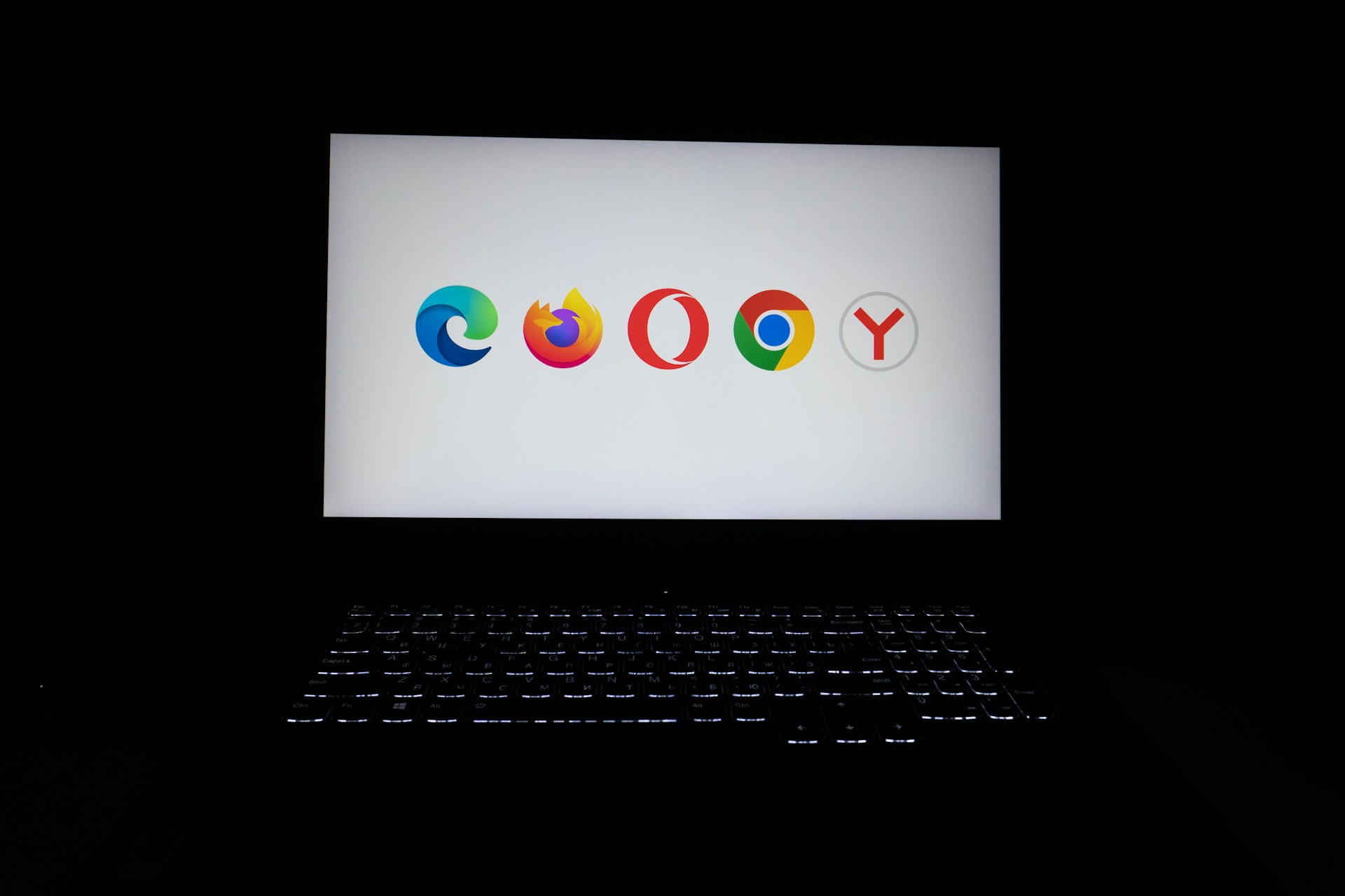
A striking common factor across many Big Tech Companies Logos is simplicity. Whether it’s an app icon on a smartphone in California or a billboard in Berlin, a simple, clean logo stands out. Minimal shapes, uncluttered design, and limited color palettes help ensure the logo remains clear on small mobile screens and large signage alike.
Simplicity also helps avoid visual fatigue. Rather than over-explain the brand’s mission, these logos use minimal visual language — letting the audience fill in meaning via trust, exposure, and repetition.
Scalability & Versatility Across Formats
One major advantage of top-rated Big Tech Companies Logos is their adaptability. These logos look sharp whether they’re scaled down to a tiny favicon for a website or stretched across a huge outdoor banner. They’re flexible and remain legible in black and white, full color, print media, merchandise, digital platforms, and more. This versatility ensures brand consistency worldwide — from New York to Paris, San Francisco to Stockholm.
To achieve this, many use vector-based formats and simple geometric shapes that maintain crispness at any size. A good standard resource for vector formats and graphic scalability is the W3C SVG Standard, which many professional designers follow for precise, resizable logos.
Memorability Through Distinctive, Clean Design
Effective logos need to be memorable. Big Tech Companies Logos often rely on bold shapes or strong wordmarks that are easy to recall. The lack of clutter — and use of distinctive design cues — helps the logos remain etched in the audience’s mind.
When people see those logos once or twice, they recognize them instantly — whether in California’s tech hubs or in Germany’s business districts. For example, a simple silhouette or a stylized letter can work more effectively than a detailed illustration.
Timelessness Over Trendy Styles
Rather than chasing design fads, many tech giants stick to classic design principles. This means their logos remain relevant over a decade or more, even as graphic design trends evolve.
By focusing on clean lines, basic shapes, and minimalist color palettes, Big Tech Companies Logos avoid becoming dated. This timelessness means less frequent rebranding and more long-term brand equity.
Brand Identity Without Over-Complexity
Though simple, these logos often subtly convey brand identity through typography, spacing, and color choice — nothing overwhelming, but enough to evoke innovation, reliability, or digital-savvy.
A hallmark of many iconic tech-brand marks is simplicity. Big Tech Companies Logos often use clean lines, simple shapes or straightforward wordmarks. This minimal approach ensures clarity and recognizability across different sizes and media — from a mobile app icon to a massive billboard. You can learn more about the key principles of effective logo design from a leading design resource.
Whether the brand targets users in the United States, the United Kingdom, or across Europe, this balance between neutrality and distinctiveness helps the logo resonate broadly and stand out specifically.
Applying These Lessons to Your Own Logo Design
Here’s how you can take cues from Big Tech Companies Logos and apply them to your own brand:
1. Embrace Simplicity from the Start
Avoid overly complex graphics or too many design elements. Stick to basic shapes, clean typography, and minimal colors. This helps your logo remain legible and adaptable across platforms — from social media avatars to signage.
2. Design for Scalability and Multiple Formats
Create your logo in vector format so it’s scalable. Test it across different contexts: web favicon, print business card, mobile app icon, large banner. It should look sharp everywhere.
3. Make It Distinct Yet Simple Enough to Be Memorable
Whether you lean toward an icon-based design or a strong wordmark — aim for uniqueness. Something easily identifiable, but not overworked or overly literal.
4. Build for Longevity — Avoid Overly Trendy Visuals
Rather than following every new design trend, invest in timeless fundamentals: balanced geometry, thoughtful spacing, color minimalism. This ensures your logo ages well whether your brand operates in London, Berlin, Barcelona, or New York.
5. Reflect Your Brand Identity Subtly
Your logo doesn’t need to tell your entire brand story. Use subtle cues — color, typography, spacing — to hint at what your brand stands for: professionalism, creativity, friendliness, or innovation.
How Big Tech Logos Influence Global Logo Design Trends
Because tech companies often operate globally — in the US, UK, Germany, France, Netherlands, Sweden, and beyond — their logos set trends that designers worldwide follow. Some of these broader impacts include:
-
Preference for minimal, flat, and clean design over heavy illustrative logos
-
Emphasis on wordmarks or simple icons instead of elaborate graphics
-
Use of neutral or limited color palettes with a single accent color — easier to brand globally
-
Demand for logos that are both digital-ready (apps, websites) and print-friendly (stationery, merchandise)
As more brands worldwide — from a startup in California to a boutique in Amsterdam — seek to communicate professionalism and clarity, the design aesthetics of Big Tech Companies Logos become templates for success.
Designing Your Logo with Lessons from Big Tech
Studying Apple, Google, Microsoft and other Big Tech Companies Logos teaches us that the most effective logos rely on simplicity, scalability, timelessness, and clarity — the very principles behind modern logo design trends.
These universal principles make a logo successful whether you’re targeting customers in the United States, the United Kingdom, Germany, France, or fast-growing branding hubs in the UAE — including Dubai, Abu Dhabi, and Sharjah.
When your logo is clean, memorable and adaptable across platforms, your brand instantly feels more professional, trustworthy and globally ready.
Get a Professional Logo Designed for Your Business
We specialise in creating high-impact logo design services tailored to your exact requirements — with branding strategies inspired by global Big Tech success.
✨ What you’ll get:
-
Custom logo concepts based on top branding principles
-
Designs optimised for US, Europe & UAE markets
-
Vector-quality files for digital + print
-
Fast delivery & revision support
If you want a logo that stands out like today’s tech innovators:
👉 Order your logo design services now and elevate your brand identity with a design that truly represents your business.


Comments
Add Comments
Update Comment