7 Flyer Design Tips Every Business Owner Should Know
I’ll never forget the first time I saw a flyer that truly stopped me in my tracks. It was vibrant, clever, and had just the right mix of text and imagery – a perfect little billboard in paper form. In a digital world where attention spans flicker in seconds, a well-designed flyer can still grab eyeballs and hearts. Whether you’re promoting a summer sale at your local boutique or a community event in downtown Chicago, smart flyer design is your silent salesperson.
You might think, “I’m a small business owner, not a professional designer!” I get it. That’s exactly why I want to share seven flyer design tips that make a big difference without needing a design degree. These tips come from real experience (and a few humbling mistakes). Each of these flyer design tips is like having a friendly expert by your side. Ready? Let’s dive in.
1. Know Your Audience & Your Message
Before you pick up the pen or fire up your design software, take a moment to picture your ideal reader. Are you targeting busy parents at a community fair, college students strolling campus, or shoppers at a mall? Identifying your audience and the goal of your flyer is step one. It shapes the tone, visuals, and even the call-to-action. For example, a flyer announcing a local concert might be loud and colorful, while one for a law seminar would stay sleek and professional.
Ask yourself:
- What’s my flyer’s purpose? Sale? Event? Announcement?
- Who am I talking to? Age, interests, location.
- What action do I want? Visit, call, RSVP, or use a coupon.
This focus keeps your flyer design on point. Need help nailing the design or copy? You can always connect with Expert Flyer Design Services to get a professional edge. This audience-first approach is the secret to an effective flyer design.
2. Craft a Catchy Headline and Copy
A bold headline grabs attention and is the first rule of good flyer design. The top of your flyer is prime real estate – if it doesn’t pop in a glance, people will just keep walking. Use action words and benefits. For example, instead of “Menu Available,” try “Crunch into Our New Chipotle Burger!” Keep it punchy and relevant.
Below the headline, support your message with a few short lines or bullets. Highlight what matters: a date, a discount, or a special feature. Bullet points or icons work great here to make info scannable. And remember: simplicity is key. Avoid packing in paragraphs of text. If you want people to actually read your flyer, give them bite-sized info.
Quick Tip: Write the headline as if you’re talking to a friend. Your flyer will feel much more human and relatable. These quick fixes can bring your flyer design from flat to unforgettable.
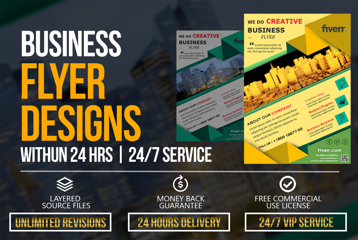
3. Use Bold, On-Brand Colors and Eye-Catching Images in Your Flyer Design
.png)
Image: Bright and bold flyer designs that use high-contrast colors and clear imagery.
Nothing grabs eyes faster than vibrant, contrasting colors. Use your brand’s palette or seasonal colors to stand out in your flyer design. For example, a summer sale flyer might use bright oranges and blues, while a health clinic could stick to calming blues and greens. Visuals matter: high-resolution photos or graphics relevant to your message are worth a thousand words (and will make your flyer look polished).
Balance is key. Let some white space (or empty space) breathe – don’t cover every inch. I once handed a friend a flyer so cluttered I had to squint! Remember, more isn’t always better. A crisp image and a couple of colors are often more effective than an avalanche of clipart. Never underestimate how strong visuals and color choices define your flyer design.
4. Choose the Right Format and Layout
A flyer design can’t be all things to all people – pick a format that fits your purpose. Common U.S. flyer sizes like letter (8.5×11 in.), half-letter (5.5×8.5), or even square cards each have a vibe.
Smaller flyers are great for quick handouts or store displays; larger or multi-panel formats can carry more details. No matter the size, organize content in a logical flow: headline at top, image or graphic in the middle, and contact info/CTA at the bottom.
|
Standard (Letter) |
8.5 x 11 |
General promotions, events, menus |
|
Half-Letter |
5.5 x 8.5 |
Handouts, postcards, info sheets |
|
Square (e.g. 7x7) |
7 x 7 (or similar) |
Modern branding, social media share |
|
Rack Card |
4 x 9 |
Counter displays, travel brochures |
|
Tri-Fold (Brochure) |
11 x 8.5 (folded) |
Multi-page info, maps, coupons |
This table shows common U.S. flyer formats and their typical uses. Choose the one that matches how you’ll distribute your flyer (handing out on street vs mailing, for example). The layout should guide the eye naturally – think of it as a mini-storyboard for the reader.
When laying out the elements, use alignment and grids (even if invisible) to keep things orderly. I usually draw some imaginary lines to line up text and images. A clean, symmetrical layout feels polished and boosts readability. These small details are what make your flyer design look polished and professional. Every alignment decision contributes to a cohesive flyer design.
5. Keep Text Clear and Impactful
Your flyer design isn’t a novel – keep the copy short, sweet, and benefit-oriented. Use bullet lists or icons to highlight details like dates, locations, and offers. A good trick is to answer “Who, What, When, Where, Why” in as few words as possible.
Avoid jargon or long sentences. Scan your text and cut any fluff. Americans love straightforward language; a simple pun or local slang can add charm if it fits your brand. Break up content into mini-sections with subheads or symbols. This makes the flyer skimmable – someone should grasp the essentials in just a few seconds.
Remember: every word counts. I often proofread aloud to catch anything confusing. If you stumble reading it, a passerby will too. Clear writing is a cornerstone of effective flyer design.
6. Include a Clear Call to Action
Never leave your reader wondering what to do next in your flyer design. A strong Call to Action (CTA) is essential. Maybe it’s “Visit our store today,” “Call now,” “Scan the QR code,” or “Use code SAVE10 online.” Make the CTA bold or in a button shape so it jumps off the page.
If you use a QR code or URL, ensure it’s big enough to scan (test it!). You can also follow best practices from resources like HubSpot’s marketing guide to improve engagement. Nowadays, tech touches can make your flyer interactive – for example, linking to a short video or map. Just explain it clearly: if you say “Scan to save 20%,” use big text and arrows if needed.
Contact info is part of the CTA package: include a phone number, website, or social handle in a legible way. I've seen creative flyers where the CTA is bright like a sticker badge saying “Learn More!” or “Join the Fun!” – don't be shy about making this pop. Each clever CTA is the final piece of your flyer design puzzle – the cherry on top of a great design sundae.
7. Use Quality Paper and Finishes
Think of your entire flyer design as a tactile experience. If your flyer design is great but your paper feels cheap, the impact is lost. Choosing sturdy paper stock can instantly make your flyer feel high-end. Glossy finishes can make colors shine, while matte can feel more refined. Think about your brand vibe: a tech startup might use slick glossy flyers; an artisanal market might pick textured, recycled paper.
Also consider special touches: spot UV (a shiny spot over a logo or image), embossed text, or a laminate layer – these are little surprises that catch fingers (and attention). Of course, balance cost with quantity, but a thicker paper or gloss can often impress more than dozens of flimsy flyers.
I learned this the hard way after handing out super-thin flyers at a festival – they looked great on screen but felt like napkins in real life. Durability matters if your flyer will be on bulletin boards or passed around.
Conclusion
There you have it – seven key flyer design tips to set your business apart. Remember: it’s not magic, it’s about understanding your audience, keeping things clear, and adding a dash of creativity. You don’t need to be a design guru to apply these ideas.
As you plan your next flyer, think of it as a conversation with your customer. Use the audience insights you’ve gathered, bold visuals, crisp copy, and a no-nonsense call to action. Trust me, even small changes (like a brighter headline or a snappy tagline) can make a huge difference.
Now it’s your turn: grab a blank canvas and start sketching or playing with a flyer template. Use these tips as a checklist. I’d love to see your flyer design! Share your cool flyers with friends or on social media and watch how your messages spread. Good luck and happy designing!
FAQs
Flyer Design Tips FAQs
Think about how you'll distribute your flyer. Handing out at events? A small half-letter or rack card could work well. Mailing? Standard letter or tri-fold for more info. In general, different flyer design formats send different vibes – bigger sizes (like 8.5×11) give more room for visuals and details, while smaller flyers feel more casual and are easier to grab. Use our size table above as a guideline.
Less is usually more. For your flyer design, a concise headline and a few bullet points or short sentences should do the job. If you find yourself writing paragraphs, that’s a sign to trim down. People should understand your message in under 5 seconds of reading. Stick to the essentials: Who, What, When, Where, and Why. Let the design and images carry some of the story.
Use both if you can! Print flyers have a tangible impact (people remember and keep them), while digital versions can reach online audiences. For instance, you can post your flyer on social media or attach it to an email newsletter. If you do go digital, adapt the design for screens (RGB colors, readable font sizes). Incorporating a QR code on your print flyer can also bridge print and digital worlds.
If you feel stuck or need a truly polished look, getting an expert can be a smart move. We’ve talked about Expert Flyer Design Services earlier. A pro can help with branding consistency, unique graphics, or tight deadlines. But you can apply most of these tips on your own. Start with a draft and polish it gradually – even small tweaks can make your design look more professional.
Clutter is the enemy. Don’t cram too much info, or use hard-to-read fonts and poor images. Always do a test print or show a draft to a friend – if anything is confusing or ugly, fix it. Remember that your flyer is a first impression of your brand. Make sure it’s clear, on-message, and inviting rather than overwhelming or vague.


Comments
Add Comments
Update Comment